The challenge
Tensoflex is a tensioned screen company, leader in the Brazilian market and with a vision of expanding its international operations. Motora's challenge was to respect the company's more than 20 years of legacy, maintaining its colors and general aesthetics of the logo, but bringing an updated, modern and sophisticated speech that reflected the brand's current moment and the place it already occupies in the imagination of their customers.
The strategy
Understanding, through interviews with Tensoflex customers, its leading place in the market in both quality and innovation, we position the company as a specialist and innovator. The phrase “What would you be able to create if there were no limits?” guides the brand manifesto and summarizes the creative potential of working with Tensoflex at your side.
PT-BR
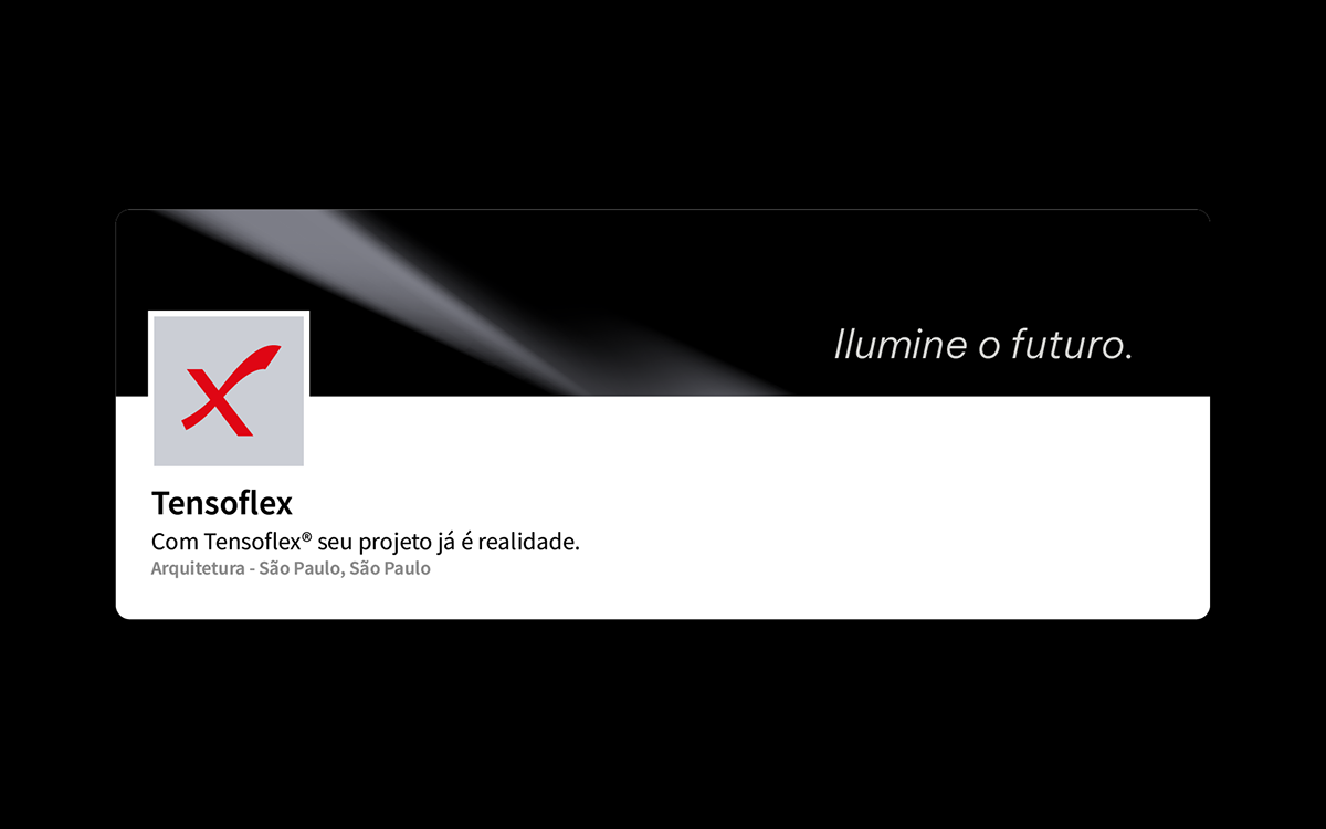
O desafio
A Tensoflex é uma empresa de telas tensionadas, líder no mercado brasileiro e com visão de expandir sua atuação internacional. O desafio da Motora foi respeitar os mais de 20 anos de legado da empresa, mantendo suas cores e estética geral do logo, mas trazendo um discurso atualizado, moderno e sofisticado que refletisse o momento atual da marca e o lugar que ela já ocupa no imaginário de seus clientes.
A estratégia
Entendendo, através de entrevistas com os clientes da Tensoflex, seu lugar de liderança no mercado tanto em qualidade quanto em inovação, posicionamos a empresa como especialista e inovadora. A frase “O que você seria capaz de criar se não houvessem limites?” guia o manifesto da marca e resume o potencial criativo de se trabalhar com a Tensoflex ao seu lado.


Brand and visual identity
The brand developed for Tensoflex is a modernization of the previous logo, already established in the market. The typeface is updated to a geometric style, evoking the brand's technological concept. The curves are smoother and the set is lighter compared to the previous brand.
Its symbol, represented by the letter X in its name, is adjusted to dialogue directly with the letter "e", with its curves redesigned to bring more fluidity and harmony.
The rest of its visual identity reinforces Tensoflex's sophisticated positioning: the sober colors bring seriousness, while the fluid and gradient graphics evoke modernity. The clean layouts make room for product photos to be the protagonists, showing all the possibilities that Tensoflex brings to architectural projects.
PT-BR
Marca e identidade visual
A marca desenvolvida para Tensoflex é uma modernização do logo anterior, já estabelecido no mercado. A tipografia é atualizada para um estilo geométrico, evocando o conceito tecnológico da marca. As curvas são mais suaves e o conjunto traz mais leveza em comparação a marca anterior.
Já seu símbolo, representado pela letra X de seu nome, é ajustado para dialogar diretamente com a letra "e", tendo suas curvas redesenhadas pra trazer mais fluidez e harmonia.
O restante de sua identidade visual reforça o posicionamento sofisticado de Tensoflex: as cores sóbrias trazem seriedade, enquanto os grafismos fluidos e em degradê evocam modernidade. Os layouts limpos abrem espaço para que as fotos do produto sejam as protagonistas, mostrando todas as possibilidades que a Tensoflex traz aos projetos arquitetônicos.